I recently read that article here: AdSense Strategy: No Borders, Mo’ Money at V7N from Peter Da Vanzo and would like to add a little follow up, very nice article by the way :).
After you removed all borders from your AdSense Ads and formated its colours there’s one alignment which serves great power. Look at this screenshot for example:
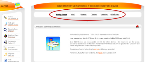
What you see here is AdSense aligned in a way to show up as additional Navigation Bar. Of course it’s not a real navigation bar of that site but it looks like it. Newbies will probably go and click on those items because they think it’s part of the Navigation.
If you want to create such an AdSense-Navigation-Bar you need to go for a Text-Link Ad with border and font colour adjusted to your site, read the article posted above for more information about that.
5 comments ↓
Great Article, thanks for the hint!
[…] V7N Blog reader Andreas Kraus has picked up the ball and run with it. Andreas has a great, succinct post demonstrating how to merge Adsense into site navigation. […]
[…] He recommends that after removing the borders from your Adsense Ads, you might want to try aligning them in a way to show up as additional Navigation Bar. You can click the link to view the screenshot. […]
Thanks for tip. I’ll keep this in mind.
2006 subaru wrx sti…
2006 subaru wrx sti author…
Leave a Comment